8 Common Mistakes To Avoid When Designing Barcodes

Thumbnail image of 8 Common Mistakes to Avoid When Designing Barcodes

Share This Post

Barcode labels are an essential part of any modern business. They are used to identify and track products throughout the entire supply chain.

Although barcodes are pretty simple in their design, many businesses make mistakes when creating and implementing them on product labels. These mistakes reduce the effectiveness of barcodes and even cause costly errors in inventory management.

In this article, we will discuss some common barcode mistakes that should be avoided when designing and printing barcodes.

So without further ado, let’s get started.

Choosing the Wrong Barcode Symbology

Choosing the incorrect barcode symbology is one of the most common barcoding mistakes that users make while designing barcodes.

Different countries, states, and industries have different rules and regulations regarding barcodes. These rules and regulations clearly state which barcode symbology and what information needs to be encoded within a barcode.

Therefore, it is always recommended to carefully research the industry’s barcode requirements before designing or choosing a template from barcode software.

Our barcode 101 guide will assist you in understanding various barcode symbologies.
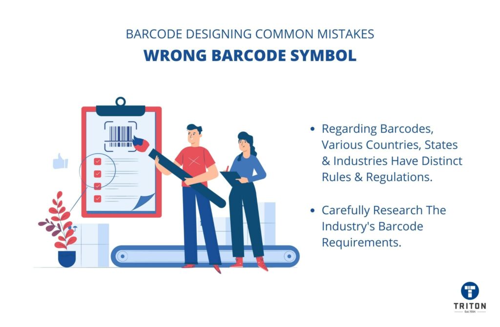
Points to consider to avoid wrong barcode symbol
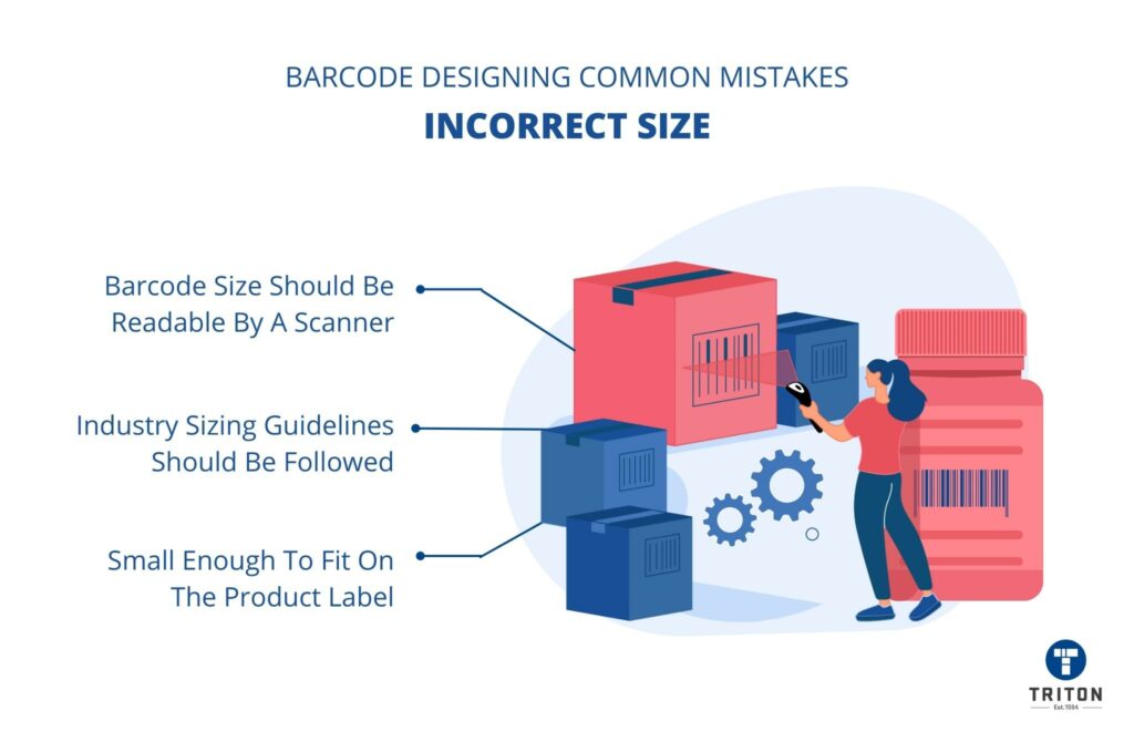
Three points to be understood to avoid incorrect barcode size

Incorrect Size of the Barcode

Barcodes should be printed in a size that is readable by a barcode scanner but small enough to fit on the product label. Unfortunately, many users choose barcode sizes that are too big or too small, leading to scanners misreading the barcode or not recognising it.

The barcode sizing issue can be easily avoided by following the sizing guidelines and recommendations provided by the relevant industry. The barcode size requirements will vary depending on the type of barcode used.

For example, a UPC-A barcode label should measure 1.469 inches wide (from the far left-hand side number to the far right-hand side number) and 1.02 inches tall (from the top of the barcode to the bottom of the human-readable numbers). 

Changing the Shape & Size

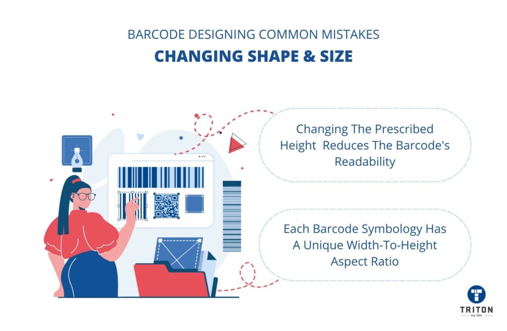
Once a barcode is designed, changing its shape and size by scaling, stretching, or warping is never a good idea.

Each barcode symbology has a unique design specification that sets the barcode’s width-to-height aspect ratio. This aspect ratio ensures that the barcode reader will accurately read the barcode. Shortening (also called truncation) or lengthening the barcode below the prescribed height reduces its likeliness of being read by barcode readers.

If you are required to change the shape and size of the barcode, please regenerate it and replace it on the label. We supply BarTender label design software which can help with all aspect of the label design.

Meaning and causes of changing shape and size of Barcode
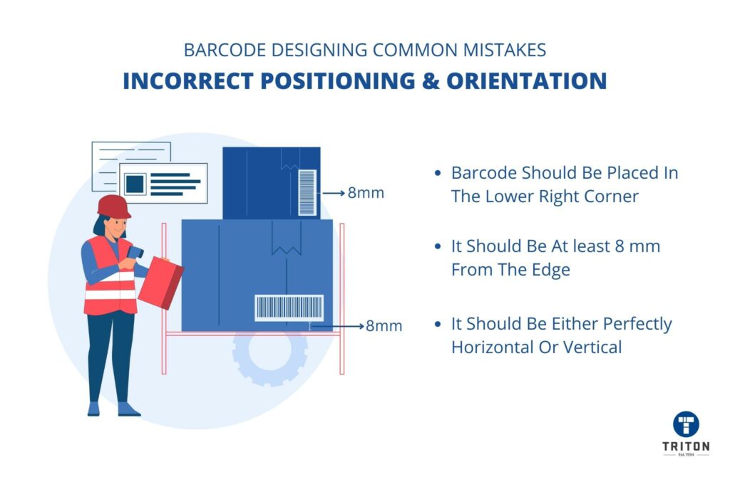
Points about the correct positioning and orientation of the barcode

Incorrect Positioning & Orientation

Barcode position and orientation play a critical role in the readability of barcodes.

Ideally, for retail goods, barcodes should be placed in the lower right corner of the packaging. The barcode should be at least 8 mm from the edge of the package. Moreover, the orientation of the barcode should be either perfectly horizontal or vertical, with no angle in between.

Please refer to GS1’s guidelines for bar code symbol placement pdf for more general information about barcode orientation and position.

Using Incorrect Colour Combination

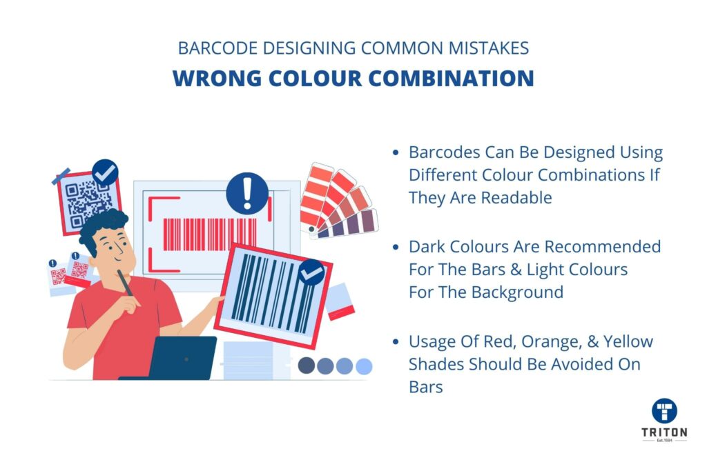
Traditionally, barcodes contain black or blue parallel lines printed on a white or transparent background. However, barcodes can be designed using different colour combinations, provided they are readable.

When changing the barcode colour, choose a combination with dark bars (low reflectance) on a light (high reflectance) background. Dark colours, such as brown, navy blue, and forest green, are recommended for the bars, whereas light colours, such as yellow and pink, are suitable for the background.

Please avoid using shades of red, orange, and yellow on the vertical bars, as these colours have poor contrast and are difficult for barcode scanners to read.

Illustration explaining what and what not colours to use a a colour combination for a barcode
Two points to consider to avoid messing the barcode font

Messing With Barcode Font

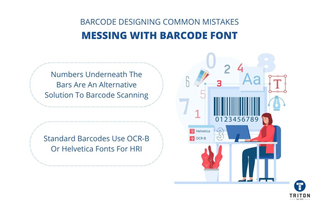
Generally, barcodes have some numbers (0-9) printed beneath the parallel bars. These numbers are human-readable interpretations (HRI) of the encoded value in the barcode.

In case a barcode becomes unreadable due to damages or other reasons, the numbers underneath the bars can be entered manually into the database to retrieve the encoded data.

These numbers underneath the bars are an alternative solution to barcode scanning. Hence, it is essential to use a font that is easily readable by the human eye.

Standard barcodes use OCR-B or Helvetica fonts for their HRI. This font is changeable; however, it is never recommended to do so.

If you still wish to change the barcode font, choose a clear and legible font like Futura or Arial.

Not Leaving Enough Quiet Zones

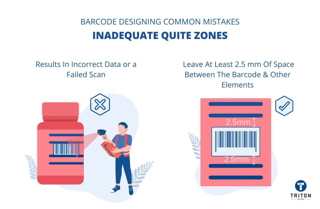
Quiet zone refers to the blank space at either end (margins) of a barcode. This area should be kept clear of design elements like logos, images, and text.

Barcode scanners read the bars from left to right to scan the barcode correctly. Hence, any design elements or text on either end of a barcode may interfere with the scanner’s line of sight when capturing the barcode. This results in incorrect data or a failed scan.

Ideally, you should leave at least 2.5 mm of space between the barcode and other elements on a product’s packaging.

How to designing barcode and avoid inadequate quiet zones
Testing the barcode verification correctly and not ignore it

Ignoring Barcode Verification Before Printing

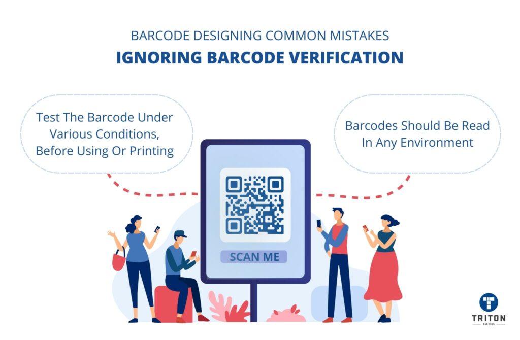
Before printing with your thermal label printer and using barcodes on your products and packaging, test the barcode.

Take a barcode scanner and scan the barcode. See if the barcode is being read accurately and error-free. If there are any issues like printing errors, incorrect data or damaged bars, fix them and retest until it is perfect.

It is also a good idea to test your barcodes under various conditions, such as different lighting conditions or at different angles. This will ensure that your barcodes can be read in any environment.

The Bottom Line

Barcodes might seem like a small detail, but they’re actually a critical part of your product’s packaging design. To ensure that your barcodes are readable and error-free, avoid these eight common barcode errors while designing them.

We hope this article has helped you understand how to design bar codes correctly.

Are you looking for tips on designing product labels? Check out our blog post on best practices for designing barcodes and labels.

Latest Articles

Learning Centres