You design a bright, detailed, perfect image that looks razor-sharp on screen at 300 PPI. Then you print it, and it turns soft.
The reason?
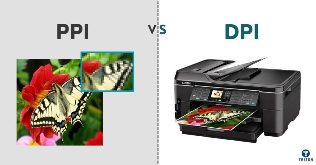
Mixing up PPI and DPI.
PPI, or pixels per inch, measures how densely pixels pack on your display. DPI, or dots per inch, defines how many ink dots your printer fires onto paper.
They sound similar but live in different worlds, digital versus physical. And when they clash, detail dies.
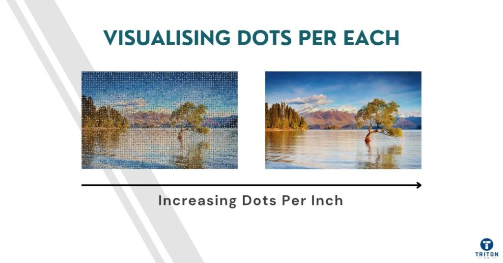
Commercial printers run anywhere from 300 to 2400 DPI, depending on the press, substrate, and finish. Meanwhile, most digital artwork sits between 72 and 300 PPI. Matching one to the other is not guesswork; it’s basic math.
This guide dunks the jargon in the bin.
You’ll learn how PPI and DPI differ, when each matters, how to convert between them, and how to avoid the costly mistakes that ruin output.
Think of PPI and DPI as two sides of the “resolution” coin.
Both describe density, but one belongs to the digital world and the other to the physical page. Confusing them leads to wrong print sizes, fuzzy edges, and poor colour control.
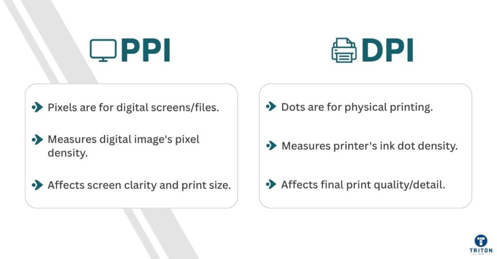
PPI stands for pixels per inch. It defines how many pixels sit inside one inch of a digital image. More pixels mean more visual information, smoother gradients, sharper edges, and finer detail.
A 300 PPI image packs 300 x 300 = 90,000 pixels into every square inch. Drop that to 72 PPI, and you will have only 5,184 pixels in the same area, barely six per cent of the original.
On a monitor, software smooths over the loss. In print, that loss becomes painfully visible.
DPI, or dots per inch, describes how many microscopic ink dots a printer deposits on paper. Those dots overlap and blend to form tones and colours.
Unlike pixels, dots vary in size, shape, and spacing depending on the printer.
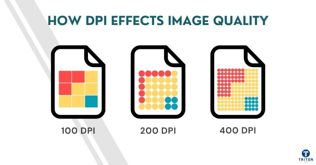
A 600 DPI laser printer fires 360,000 dots per square inch. High-end offset presses push that to 2400 DPI, using halftone screening to control colour and depth.
DPI is a mechanical limit. A printer can’t produce details finer than its droplet pattern & size.
PPI and DPI interact but are never equal.
Your 300 PPI image doesn’t automatically print at 300 DPI. Instead, the printer’s driver or RIP (Raster Image Processor) interprets those pixels, turning each into clusters of ink dots.
To recreate the tone, a single pixel uses cyan, magenta, yellow, and black dots. More DPI gives smoother gradients, but doesn’t add new image detail.
Here’s where resolution and dimension trip people up.
Resolution (PPI) tells you how tightly pixels are packed. Dimension tells you how large the image prints. Multiply the two, and you will get the total pixel count.
A 3000 x 2400 px image at 300 PPI prints cleanly at 10 x 8 inches on a 300 DPI printer, because the image resolution matches the printer’s dot density.
Drop the PPI to 150, and that file expands to 20 x 16 inches, larger, but noticeably softer, even if your printer still fires at 300 DPI.
DPI doesn’t change the number of pixels; instead, it changes how they spread across paper.
The first is made of tiny, square pixels. Each is a solid block of colour, neatly aligned, edge to edge. That’s your digital image.
The second grid is messier, with thousands of round dots overlapping in tight clusters of cyan, magenta, yellow, and black. That’s your printed version. Those overlapping dots mix optically to recreate the colours your screen emits directly.
Digital pixels emit light; printed dots absorb it.
That difference explains why bright screens mislead you. What looks luminous on your monitor dulls in print because ink absorbs and reflects, not emits, light.
Modern displays complicate this further. A standard desktop monitor has a resolution of 90-110 PPI. A 4K 27-inch screen reaches roughly 163 PPI, while smartphone displays easily exceed 400 PPI.
Apple’s Retina displays go past 300 PPI, which is dense enough that you can’t see individual pixels from about 12 inches (30 centimetres) away. That’s why photos look hyper-sharp on screen, because they’re displayed more densely than most printers reproduce.
Printers, by contrast, translate image density differently. Consumer inkjets usually operate around 300-600 DPI. Office laser printers reach 1200 DPI, and professional offset presses exceed 2400 DPI.
That doesn’t mean they print more “pixels”.
This means that each image pixel is interpreted into finer dot structures. A 600 DPI print will appear smoother, especially in gradients and skin tones, but if your source image is low PPI, those dots only reproduce blur in higher fidelity.
The takeaway is simple.
PPI sets potential detail. DPI realises it.
If your file’s PPI is too low, no printer, not even a 2400 DPI press, can help you. Conversely, supplying an ultra-high PPI file to a low-end printer wastes data, memory, and processing time without gain.
Understanding this link keeps you in control. When your display, artwork, and printer work at compatible densities, output looks consistent, crisp on screen, and crisp on paper.
Knowing the difference is one thing. Using it right is where skill shows. Whether you design digital art, photograph products, or prepare files for print, your choices in PPI and DPI decide how your work looks when it leaves the screen.
Your image lives and dies by its source resolution. Editing at low PPI locks you into small, brittle files that collapse when you resize.
Work large.
Retouch at 300 PPI or higher, even if your final use is print. High PPI keeps headroom for print later. Scaling down is painless, but scaling up isn’t.
Export by pixel dimension, not PPI, when preparing images for websites or portfolios. A 1920 x 1080 file fills an HD frame perfectly, regardless of the PPI value in its metadata. Online, the monitor’s pixel grid defines sharpness. What matters is compression, colour profile, and viewing distance, not print resolution.
Still, detail counts. A smartphone display showing 400 PPI or more exposes every editing flaw. Halos, jagged edges, and banding appear instantly. Working at high PPI during retouching ensures those artefacts stay invisible at any display density.
Printing introduces the hardware’s DPI. Here, alignment matters. A mismatch wastes data or ruins detail.
Every print device has a sweet spot. Inkjets for general use hover around 300-600 DPI. Laser printers and digital presses often hit 1200 DPI. Offset presses go past 2400 DPI with precise halftone screening. Feed each one with files prepared using the proper PPI for its DPI range.
Use this simple ratio:
Matching these keeps pixels productive while higher PPIs bloat file sizes without visible improvement.
Take an A4 print (8.27 x 11.69 inches). At 300 PPI, your file measures 2481 x 3508 pixels. Printed at 600 DPI, it looks clean and continuous – tone transitions smooth, lines razor-defined.
Drop that file to 150 PPI and print it at the same DPI. The result? The same photo, same size, half the pixel data – visible grain, flat midtones, fuzzy edges. The printer does its best, but interpolation never beats genuine detail.
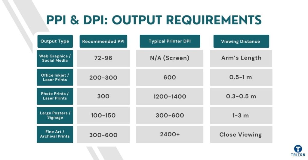
A poster viewed from two metres away forgives a lot. You’re not expected to count fibres or hair strands. That’s why large-format printers happily run at 100-150 PPI source files and 300-600 DPI output.
Fine-art prints are a different league. They’re handled, scrutinised, and sometimes sold by the square inch. Here, every tonal gradient matters. Professionals print those at 300-600 PPI source resolution on 1200-2400 DPI devices.
Start with the end in mind. Decide the viewing distance, print size, and output DPI before you begin editing. Build your file for that purpose. Avoid resizing near the end of the process because it changes how sharp edges look and can make textures too harsh or soft.
You know the theory. But in practice, this is where people trip, the everyday errors that quietly wreck print quality or waste hours of rework. Let’s cut through the most common myths.
No. PPI applies to digital files (pixel density). DPI applies to prints (ink dot density). Each governs a different medium. This distinction matters because you can’t expect a printer to use your PPI value directly; it adapts it to its dot structure.
Changing PPI affects how big the image prints, not how the printer fires its dots. Changing DPI changes how those dots are laid down on paper, not how your pixels are arranged.
You edit a 300 PPI photo, print it at 600 DPI, and it looks perfect. But if you drop the file’s PPI to 72 before printing, the printer doesn’t magically upscale it. It spreads those pixels over more paper, and the result looks soft.
Resizing changes print dimensions without altering the pixel count. Resampling changes pixel count by adding or removing pixels.
Interpolation is used during resampling, which invents or discards image data. Resampling degrades quality.
Guesswork costs quality. Downsampling throws away fine texture; upsampling fakes detail that never existed. The safest approach is to capture and edit at the target resolution from the start. Resize for print only at the end, and always turn resampling off unless you know why you need it.
No. Higher DPI only improves smoothness up to a point. Increasing DPI won’t bring back lost detail if your image has low PPI. Once the dots are smaller than the eye can see (roughly 300 DPI) at a normal viewing distance of about 30 centimetres (12 inches), extra DPI makes no visible difference. It only smooths tonal transitions slightly, not overall sharpness.
Take offset printing as an example. It often runs at 150 LPI (lines per inch) halftone screening, translating to about 300 DPI effective resolution. Going to 2400 DPI doesn’t make photos crisper; it just refines the dot edges for cleaner gradients. Quality depends more on image prep, colour accuracy, and substrate than the printer’s raw DPI number.
Large prints are viewed from far away. At metre-plus distances, your eye blends ink dots. Therefore, a low source PPI (~100-150) is adequate for banners or signage. Using unnecessarily high PPI for large prints only inflates file sizes and slows RIP processing without visible gain.
A two-metre-wide banner printed at 100 PPI on a 300 DPI printer looks just as sharp from two metres as a magazine photo printed at 300 PPI viewed from 30 centimetres. Using unnecessarily high resolutions for large prints only inflates file sizes and slows RIP processing without visible gain.
Common pitfalls include exporting with the wrong colour space (RGB instead of CMYK), using mismatched ICC profiles, or enabling “fit to page” scaling. These errors silently alter your effective PPI or distort colours before printing.
Mismatched settings cause dull reds, muddy blacks, and washed-out blues. Another killer is automatic “fit to page” scaling. It stretches or shrinks your artwork, silently rewriting the effective PPI. Always check the final export dimensions and resolution before sending a file to print.
Printing becomes predictable if you do the math. Knowing how pixels, size, and resolution connect lets you control output before you ever hit ‘Print’. Here is how to convert between PPI and DPI
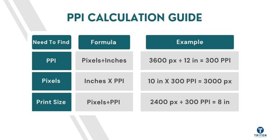
PPI = Pixel Dimension ÷ Print Dimension (in inches)
Example:
You have an image that’s 2400 x 3600 pixels and want to print it at 8 x 12 inches.
If you enlarge that same file to 12 x 18 inches, PPI drops to:
Use the conversion formula given below to calculate the minimum pixel dimensions for a given print size and DPI target:
Pixels = Print Size (in inches) x Target PPI
Example:
To print an A4 photo (8.27 x 11.69 inches) at 300 PPI.
Take a 2400 x 3600 px image and print it at 300 PPI.
Width = 2400 ÷ 300 = 8 inches
Height = 3600 ÷ 300 = 12 inches
So the maximum print size is 8 x 12 inches at maximum clarity.
Drop the print resolution to 150 PPI for larger format use:
Width = 2400 ÷ 150 = 16 inches
Height = 3600 ÷ 150 = 24 inches
You’ll get a 16 x 24-inch poster, still sharp from a distance.
These numbers are your safety net. Once you know them, you’ll never guess print quality again, and you’ll know it before the ink even hits paper.
Printers advertise impressive DPI numbers, but those figures don’t tell the whole story. Real output depends on how a device handles dots, ink, and interpretation.
A 600 DPI inkjet and a 600 DPI laser don’t deliver the same sharpness.
Inkjet printers fire microscopic droplets that spread slightly as they hit paper, softening fine edges and darkening shadows. Laser printers use electrostatic charge to place dry toner precisely, then fuse it with heat. The result is cleaner text and sharper lines, but a narrower tonal range.
In practice, a well-tuned 600 DPI laser often looks cleaner than a budget inkjet claiming 1200 DPI, because consistency beats raw numbers.
High-end devices like offset presses push resolution to 2400 DPI and beyond, not to add more “pixels,” but tonal accuracy and ink coverage in complex gradients
They achieve this via calibrated rollers, plate alignment, & ink-film thickness. The focus is on uniformity and repeatability, where every dot in every run is almost identical.
Behind every print is software translating pixels into printable dots. That’s the printer driver, and it performs interpolation when the image resolution doesn’t match the printer’s DPI. It scales the input PPI to fit the printer’s grid, estimating missing tonal steps through dithering or halftone algorithms.
The process doesn’t add detail but spreads existing data more evenly to reduce visible banding. This is why sending unnecessarily high-resolution files only slows the pipeline; the driver still condenses them to what the printer’s dot pattern can handle.
Two other resolution terms enter the workflow: SPI (samples per inch) and LPI (lines per inch).
Scanners use SPI to describe the fineness of data capture. Printers use LPI to describe halftone density.
A high-quality magazine image might be screened at 150 LPI, which needs roughly 300 PPI source resolution. For fine art prints, LPI should be at least 200.
Printer resolution numbers don’t tell the whole story. What matters is how each printer uses its dots.
For instance, a 600 DPI office laser prints precision text and clean vector graphics. It lays toner sharply and consistently, making it ideal for documents, proofs, and line art.
However, a laser printer is not great at printing smooth tonal gradients or subtle textures.
This is where offset press printers come in. An offset separates colour into thousands of controlled halftone dots, layering cyan, magenta, yellow, and black to reproduce tone and depth. The higher DPI isn’t just about more “pixels” but ink placement accuracy. Each dot’s size, spacing, and angle are tuned to manage paper absorption and prevent overlap.
The difference is dot count versus dot control.
Lasers focus on edge sharpness and speed, while offset presses focus on tonal accuracy and consistency across long runs.
Image resolution is only part of print quality. Further precision comes from how data, colour, and tone are processed before printing. Colour management aligns device gamuts, screening defines dot structure, and RIP processing converts digital pixels into the printer’s DPI grid. These three systems determine the final sharpness and accuracy.
Colour management keeps your image looking the same on every screen and printer. It relies on ICC profiles, gamut limits, and device calibration.
An ICC profile tells your computer how a device handles colour, viz., what it can reproduce accurately and where it falls short.
Every screen, camera, and printer has a colour range or gamut. A high-end monitor shows millions of shades a CMYK printer can’t reproduce.
The printer’s ICC profile adjusts those colours to the closest printable equivalents, keeping tones consistent.
Calibration locks that accuracy in place. Monitors drift over time, changing brightness or tint. Printers shift as inks age or paper types change.
Regular calibration ensures a predictable workflow and improves “effective resolution”.
Poor calibration exaggerates contrast or flattens tonal detail, making even a high-resolution image muddy. A well-profiled printer keeps gradients smooth and detail crisp.
Printers build colour tones from tiny dots. Halftone screening decides how those dots are arranged. The two main types are AM (Amplitude Modulated) and FM (Frequency Modulated) screening.
In AM screening, the dot size changes while the spacing stays constant. Larger dots make darker areas, and smaller dots form lighter tones. This creates the familiar rosette pattern in magazines under a magnifying glass. It’s reliable, but those patterns can become visible at lower resolutions.
FM screening flips the idea. Dot size stays the same, but spacing changes. Dots cluster more tightly in dark areas and spread out in light ones. This removes visible patterns and increases tonal smoothness, especially in high-end photo or fine-art printing.
Both systems face dot gain, where ink spreads slightly on paper, making dots larger than intended. Dot gain reduces contrast and fine detail. Printers compensate for this by adjusting curves during prepress or using coated papers that limit absorption.
Choosing the correct screening method depends on the job. Newspapers use coarse AM screens (85-100 LPI) for speed and ink economy. Magazines go finer (150-200 LPI). FM screening produces smoother gradients and cleaner textures for art prints or photographic reproductions.
The Raster Image Processor (RIP) is the final stage between your digital file and the printer. It converts images, text, and vector data into a raster grid that matches the printer’s native DPI. This process, called rasterisation, determines how accurately every pixel is translated into printed dots.
The RIP applies ICC profiles, screening methods, and calibration settings to maintain colour accuracy and tonal balance. RIP keeps ink coverage even, converts RGB files to CMYK, and keeps gradients smooth across complex images. It also decides how many dots represent each pixel, how those dots overlap, and how different inks mix on the substrate.
However, the RIP won’t create new detail if your file’s PPI is too low. It will distribute the existing pixels more widely, leading to a softer print.
Modern RIPs also manage ink limits, compensate for dot gain, and control print-head alignment to prevent banding or uneven tone.
PPI and DPI decide how digital precision becomes physical quality. Get them wrong, and you waste ink, time, and trust. Get them right, and every print matches your intent.
For deeper control, look beyond resolution. Tools like calibrated monitors, high-gamut printers, and accurate RIP systems turn consistency into a process.
If you want professional-grade hardware, visit Triton Store to explore our range of printers and scanners built for serious output.